Fix Message Match First: Landing Page Best Practices for Campaigns
Conversion first playbook that fixes message match, hero, form, speed, and testing in order. Includes Kreante rapid prototype checklist.
Development
KreanteSeptember 16, 20266 hours ago
The single best practice is to build one page with one clear conversion goal: lead with the outcome, put a matching CTA above the fold, and keep the page fast and mobile-first before you touch anything else. Everything after that, testing, copy polish, extra proof, is optimization on top of a foundation. Skip the foundation and the optimization has nothing to lift.
TL;DR:
Message match between the ad and landing page is crucial, as discrepancies can significantly reduce visitor retention and conversions. An effective hero section must clearly state the outcome, add a visual, include a distinct CTA, and feature a trust cue within three seconds. Keep forms short by only asking for essential information, use multi-step forms for qualification, and place reassurance notes immediately above the submit button to boost submissions. Trust signals should scale with offer risk, from simple user counts for low-risk content to detailed case studies and compliance badges for enterprise deals. Prioritize speed on mobile by compressing images, deferring non-critical scripts, and lazy-loading content, aiming for a load time under 2.5 seconds.
Kreante
Build Landing Pages Around Outcomes
Kreante builds web applications and AI systems around measurable business outcomes, from shorter cycles to fewer manual hours.
What Are the Essential Landing Page Best Practices to Check First?
Run this list before you launch, and rerun it every time performance dips. Most conversion problems trace back to one of these gaps.
Message match: the headline repeats the exact promise from the ad, email, or search result that sent the visitor here. If your ad says “50% off first order” and the page says “Welcome to our store,” you’ve already lost half your traffic.
One conversion goal per page: a demo request page should not also try to sell a newsletter signup and a case study download. Pick one action.
Benefit-first headline plus CTA above the fold: the visitor should see what they get and how to get it without scrolling.
A trust cue near the fold: a customer count, a rating, or a recognizable logo, placed where the eye naturally lands after the headline.
Shorter forms: cut every field that isn’t required to qualify or fulfill the request.
Two to three A/B tests queued up: headline, CTA copy, and form length are the highest-leverage places to start.
Most teams treat this as a launch-day checklist and never look at it again. Treat it as a monthly audit instead, especially after a new campaign or a traffic source change.
Above the Fold and the Hero: What Keeps Visitors Past Three Seconds?
Visitors decide whether to stay or leave within roughly three seconds of landing, according to Nielsen Norman Group’s research on page attention. That window is not enough time for clever copy. It’s barely enough time for a headline and a glance at the CTA.
Your hero section has four jobs to do in that window, and it needs to do all four at once: confirm the visitor landed on the right page, state the primary benefit, establish some baseline credibility, and show a clear next step. Miss any one of those and the visitor bounces before your second paragraph gets read.
Here’s a working formula for structuring that space:
Outcome headline, 8 words or fewer. State what the visitor gets, not what your product does.
A clarifying subhead that adds the “how” or the “for whom” the headline left out.
A visual that shows the outcome, not a stock photo of people smiling at a laptop.
One primary CTA button, visually distinct from everything else on the page.
A single trust cue next to or below the CTA, a rating, a client count, a recognizable logo.
Below the CTA, a short friction reducer does real work: “Takes 60 seconds,” “No credit card required,” or “Setup in one day” all reduce the mental cost of clicking. These five or six words often outperform an entire paragraph of persuasive copy, because they answer the objection the visitor was about to form.
Pro Tip:Run your first hero test as a full-variant swap, not a tweak. Test headline A with CTA A against headline B with CTA B as two complete packages, rather than isolating one variable. You’ll learn faster which combination works, then split-test the individual elements once you have a winner.
Pages that lead with a customer outcome instead of a product description consistently score higher on conversion than pages that open with feature lists. That’s not a copywriting preference. It’s what happens when you match how people actually scan a page under time pressure.
How Do You Write Copy That Reduces Hesitation Instead of Building It?
Start with the outcome, not the feature. A dependable headline formula: “We help [audience] achieve [outcome],” with a measurable benefit attached whenever you have one.
Specificity is what separates copy that converts from copy that just sounds nice. “Save time” is forgettable. “Cuts onboarding from three weeks to four days” sticks, because it gives the reader something concrete to picture and compare against their own situation.
A few rules for the body copy itself:
Use numbers wherever you have them. A vague claim (“many happy customers”) reads as filler; a specific one (“4,200 teams”) reads as fact.
Write bullets that each carry one idea. Three words to twelve words per bullet, never a run-on sentence disguised as a list item.
Break paragraphs at three sentences, maximum. Skim readers, and that’s most of your traffic, need visual breathing room to keep scanning instead of bailing.
Handle objections inline, not in an FAQ buried at the bottom. If price is the likely hesitation, address it near the CTA: “Plans start at $29/month, no setup fee.”
Use click triggers sparingly. A short line next to the button, “Cancel anytime” or “Free for 14 days,” removes the last bit of doubt right before the click.
None of this replaces a strong offer. But weak copy on a strong offer routinely underperforms, because the visitor never gets far enough to understand what you’re actually offering.
What Makes a CTA and Form Impossible to Ignore or Avoid?
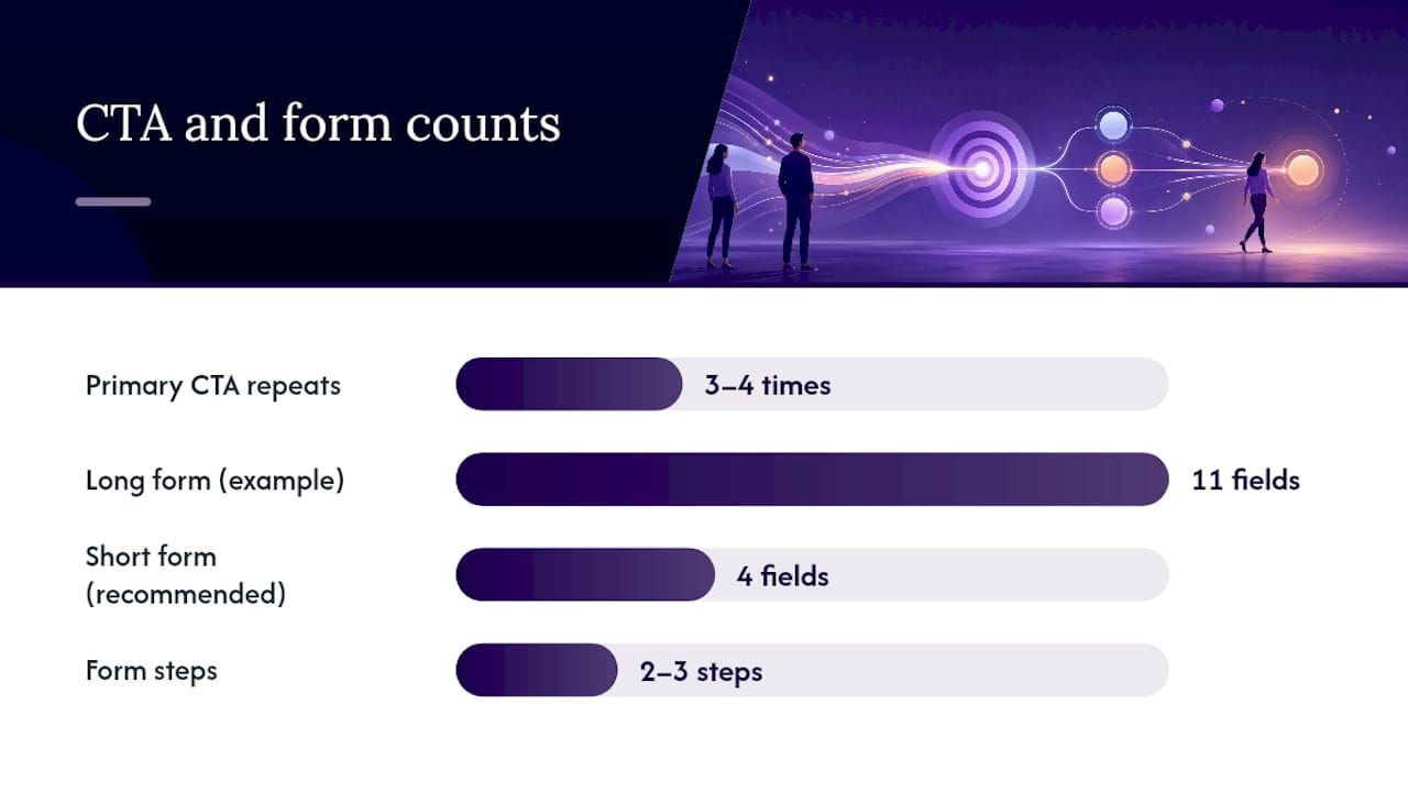
Repetition beats variety here. Top-performing pages repeat the same primary CTA three to four times using identical wording, rather than offering different calls to action at different points on the page. A “Get Started” button at the top and a “Learn More” button lower down splits intent and makes the visitor decide between two actions instead of committing to one.
CTA copy should set an expectation, not just command an action. “Start Your Free Trial” tells the visitor what happens next and what it costs (nothing, for now). “Submit” tells them nothing. Where you can, fold in time-to-value: “Get Your Quote in 2 Minutes” beats “Contact Us” because it answers “how long will this take” before the visitor has to ask.
Form design is where a lot of otherwise solid pages quietly bleed conversions. Reducing a form from 11 fields down to 4 can more than double conversion rates in some cases, and it’s often the single biggest lever on the page. A few practical rules:
Collect only what you need to act on the lead right now. Ask for job title later, in a follow-up email, not on the first form.
Use multi-step forms for qualification-heavy offers. Breaking a long form into two or three short steps feels lighter than one long one, even when the total field count is the same.
Apply progressive profiling after the first conversion. Learn more about the lead over time instead of front-loading every question.
Use a form builder that supports this out of the box rather than hand-coding field logic; tools covered in this comparison of form builders handle multi-step logic and validation without custom development.
Pro Tip:Put a one-line guarantee or privacy note directly under the form, not in a footer link. “We never share your email” or “30-day money-back guarantee” placed within eye range of the submit button removes hesitation at the exact moment it would otherwise cause a visitor to close the tab. Good CTA design and placement treats the button as the culmination of everything above it, not a decoration at the bottom.
Which Trust Signals Actually Match the Risk of Your Offer?
Not every offer needs the same proof, and stacking heavy trust elements on a low-commitment offer can actually slow people down. The right trust stack scales with how much the visitor is being asked to risk, whether that’s money, time, or reputation within their own company.
For a low-risk offer, a free ebook or a newsletter signup, a simple user count or a short social proof pill does the job: “Join 12,000 marketers who read this weekly.” Anything heavier feels like overkill for a ten-second commitment.
For a medium-risk offer, a free trial or a demo request, recognizable client logos paired with a named testimonial carry more weight. A quote attributed to “Sarah T., Head of Growth at [Company]” reads as real. An anonymous “Great product!” does not.
For a high-risk offer, an enterprise contract or anything touching sensitive data, case studies and compliance badges (SOC 2, GDPR, HIPAA) become necessary, not optional. The visitor is often justifying this purchase to someone else internally. Generic testimonials won’t survive that conversation.
Specific numbers and named testimonials consistently outperform vague claims on every credibility dimension tested. “Trusted by thousands” is filler. “Used by 3,400 agencies in 40 countries” is proof. Place two or three proof elements in the first viewport, and make sure each one answers the objection the visitor is most likely to be forming at that moment, not just whichever stat you’re proudest of.
How Should Layout and White Space Guide the Visitor’s Eye?
Generous spacing between sections isn’t a design luxury. It measurably reduces cognitive load and makes the copy underneath easier to process, because the brain treats visual separation as a signal for “new idea starts here.”
A workable rule of thumb: leave at least 60 to 80 pixels between major sections, and don’t crowd a headline against its supporting visual. Cramped layouts make even good copy feel like a wall of text, and visitors skim past walls of text without reading a word of them.
Directional cues do real work here too. An arrow, a line of gaze from a photo, or simply the natural top-to-bottom reading flow can point attention straight at the CTA button. Pair that with high contrast: your CTA button should be the most visually distinct element on the page, not blended into a color palette that matches everything else.
Use one accent color exclusively for CTAs, never reused for decorative elements elsewhere on the page.
Keep navigation minimal or absent. A landing page with a full site menu gives visitors an exit ramp you didn’t intend to build.
Show a product screenshot or a short demo clip above the fold when the product itself is the main sell. A visitor evaluating software wants to see the interface before reading three paragraphs about it.
Left-align body text. Centered paragraphs look clean in a mockup and are noticeably harder to read past two lines.
Current website design trends lean toward exactly this kind of restraint: fewer elements, bigger type, more breathing room, one obvious action.
How Fast Does a Landing Page Need to Load on Mobile?
Aim for a Largest Contentful Paint under 2.5 seconds on mobile. Pages that load under that mark retain noticeably more visitors, and each additional second of delay costs you conversions in a way that compounds rather than degrades gently.
Since mobile traffic makes up a large and growing share of total visits, a page that only performs well on a fast desktop connection is optimizing for a shrinking slice of your audience. Three fixes handle most of the speed problem:
Compress every hero image before upload. A 4MB PNG hero photo is one of the single most common causes of a slow first paint.
Defer noncritical scripts. Chat widgets, heat map trackers, and marketing pixels can load after the main content renders, not before.
Lazy-load anything below the fold. Testimonial carousels and embedded videos don’t need to load until the visitor scrolls near them.
Mobile layout needs its own pass, not just a responsive resize of the desktop version. Tap targets should be large enough for a thumb, at least 44 pixels tall, and form fields need enough vertical space that a visitor doesn’t fat-finger the wrong input. Test all of this on an actual phone over a real cellular connection, not just a browser dev tool set to “mobile view.” Dev tools simulate screen size. They don’t simulate a spotty 4G connection on the subway, which is where a meaningful share of your mobile traffic actually is.
What Should You Test First, and What Should You Measure?
Not every element deserves equal testing attention. Some changes move the needle hard; others barely register. Run experiments in this order:
Headline and hero combination first. This is the highest-traffic, highest-impact element on the page, and it’s usually the fastest test to set up.
Form length second. Given how large a lift shorter forms tend to produce, this test alone can justify the whole testing program.
CTA copy third. Smaller lift than the first two, but cheap to test and easy to iterate on repeatedly.
Imagery and proof placement after that. These matter, but they’re secondary to getting the message and the ask right first.
Give each test enough traffic before calling a winner. A test that ends after 40 conversions per variant is essentially a coin flip dressed up as data. Most testing tools flag statistical significance automatically, but the underlying rule is simple: more traffic and more time produce a result you can actually trust.
Track four numbers after every test, not just one: conversion rate (the obvious one), lead quality (are these the right people converting, or just more people), cost per acquisition (did the win actually lower your cost), and micro-conversion events like scroll depth or video plays, which tell you where visitors are dropping off even on variants that “win” overall.
What Do Landing Page Templates Look Like for Different Offer Types?
The right structure depends almost entirely on how much you’re asking the visitor to commit. Matching your template to the offer type avoids the two most common mistakes: overbuilding a simple offer, or underselling a complex one.
For a low-commitment offer (an ebook, a checklist, a free tool), keep it short: hero section, three benefit bullets, and an email capture form. Nothing more is needed, and a longer page just adds friction to a decision that should take ten seconds.
For a mid-length offer (a demo request or a free trial), add substance without bloating the page: hero, a benefits section, one short case study snippet with a real number attached, then the form. This is the sweet spot for most B2B software and service offers, and it’s also where the landing page versus full website decision usually gets made, since this offer type sits right at the edge of needing more than a single page.
For an enterprise offer, build long-form: hero, a detailed outcomes section, a full case study with specific metrics, compliance and security elements, and an FAQ addressing procurement-style objections. The visitor here is often building an internal case to their own boss, and the page needs to hand them the ammunition to do that.
How Does Kreante Approach Landing Page Development in Practice?
Define the business outcome and the target metric before a single design decision gets made.
From there, the process runs in a specific order:
Prototype a working page within weeks, not months, using a minimal hero, one CTA, and the smallest form that qualifies a lead.
Send it a small test budget and measure real traffic behavior before investing in long-form assets, case studies, or custom illustration.
Scale the winning variant only after the data says it’s winning, not after a stakeholder says it “feels right.”
Bring in outside help when the project needs cross-system integrations, AI-driven personalization, or when your internal team’s bandwidth is already stretched across five other campaigns.
Pro Tip:Never greenlight a full custom build before a scrappy prototype has proven the message and the offer convert. A polished page built on an untested premise is expensive proof that the premise was wrong.
Speed vs. Polish: Which Approach Fits Your Campaign?
Favor speed when you’re running early experiments or testing a narrow offer against a small audience. A rough page that ships this week and gets real traffic data beats a polished page that ships in six weeks and answers nothing yet.
Favor long-form polish when the offer is high-ticket or enterprise, where a visitor’s internal buying process demands more proof and more detail before they’ll act. Rushing a page for a $50,000 contract undersells the offer.
The operational detail most teams skip: define the handoff between marketing and engineering before the first sprint, not during it. A prototype built without engineering’s input on data structure often gets rebuilt from scratch later, which erases most of the time you saved by prototyping in the first place.
— Jorge Del Carpio
Where Kreante Fits When You Need to Build and Test Fast
Kreante gets a working landing page prototype live in weeks, not months, so you’re testing real traffic against real data instead of debating mockups in a review meeting. Where an agency retainer locks you into months of scope before you see a single conversion number, this approach starts from the metric you’re trying to move and builds the smallest version of the page that can prove or disprove it.
That prototype phase is where AI consulting for outcome-driven projects earns its cost: mapping which parts of your funnel actually need AI-driven personalization versus which just need a clean, fast page. If your team wants to run this process internally going forward, AI training and enablement builds that capability in-house instead of leaving it with an outside vendor after the first project wraps. And when the winning variant needs to connect to your CRM, your analytics stack, or a personalization engine, AI implementation handles the production build without handing you a fragile, one-off script.
Start with a scoping call, get a roadmap with an expected return attached to it, and see the prototype before you commit to the full build.
Message match comes first: the headline and offer on the page must mirror the ad, email, or link that brought the visitor there, or every other optimization loses most of its effect.
A strong page needs a benefit-first headline, a clarifying subhead, one primary CTA repeated three to four times, a minimal form, and two or three trust signals scaled to the offer’s risk level.
Format depends on offer type: a short hero-plus-form layout works for low-commitment offers, while high-ticket or enterprise offers need a longer structure with detailed case studies and compliance information.
The optimal structure runs hero (headline, subhead, visual, CTA, trust cue), benefit bullets, proof elements matched to offer risk, an objection-handling section, and a final CTA repeat, all backed by a page that loads in under 2.5 seconds on mobile.
Wait until each variant has enough conversions to reach statistical significance, typically hundreds of conversions per variant depending on your baseline rate. Calling a test after a handful of conversions produces results you can’t trust.



 Development